Wednesday 15 December 2010

Photos for the Magazine Front Cover


I thought this photo went well as both girls have a very serious facial expression. They are both wearing the same clothes in which they wear in my trailer so this makes it look more convincing and obvious to the reader that the image of the two girls is specifically about the soap and not just an interview with the actresses. I particularly like the way I have positioned Ellie and Sarah so that Sarah, the victim, is standing more forward than Ellie. This pose looks more instense and many magazines such as the ones I have researched have used this pose.


I liked this this photo as they are both pulling serious expressions and I like the way they are standing. However the sunlights on the girls' photos ruins the quality of the photo. Additionally for a magazine front cover I prefer the position in which the characters are standing above.


This photo was not ideal as Sarah began to laugh as I took the photo.


Both Ellie and Sarah were laughing in this photo so I chose not to use it.


I took this photo of Josie and Rachel to feature in the corner of my magazine for an exclusive interview about "The Only Way is Essex". I thought this picture went very well as they both pulled serious faces looking the part. Rachel is pouting slightly going for a more seductive look and Josie has bent down so the height different isn't as obvious. I made them dress to look glamorous and sophisticated which I believe they did very well. The background did not matter as I had decided to cut them out anyway.


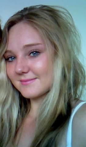
This was a photo I already had of Annabel from New Year's Eve and thought it would be appropriate for my magazine calling it "The Real Desperate Housewives".


Saturday 4 December 2010

Plans for my magazine front cover


I wanted Sarah and Ellie to be the main focus of the magazine. I placed Sarah slightly infront of Ellie as she is the one who gets killed/ attacked so the story is more like her.
I also liked the position in which they are standing as it the same as the magazine front covers I have researched.

I created a very similar name of the magazine to that I have researched but changed it so it said 24/7 to avoid it being the same.

I decided to have the headline on a bold yellow background to draw attention to it.

Wednesday 1 December 2010

Magazine front cover- Research

I think this is a good example of a magazine front cover. The colours are bold and eye catching making the magazine attractive and appealing to read.

The words "DEADLY BLAZE!" are written bolding across the page making it a main focus of the front colour. It is written in bold capital letters to draw attention to it and ensure the reader reads this before the smaller print. It is on a yellow background making it even more eye catching.

The way in which the Eastenders' characters Roxy and Ronnie are positioned on the front cover is effective as they are both smiling in the same way with the image overlapping the other images on the cover slightly. It appears as though Eastenders has the main story line for that week and is therefore the main focus.

The name of the magazine is in the corner, smaller than the image of the Eastenders' Mitchell sisters and the 'DEADLY BLAZE' title but is still equally effective and eye catching. It is written on a red background to make it bold and stand out against the rest of the magazine as the magazine name is incredibly important.

The magazine background is blue which compliments the red and yellow used. It is also slightly paler ensuring the images stand out on top of it.

Six smaller images have been used on the cover which look effective with supporting text of different colours.

There is text saying "X Factor SECRETS INSIDE" inserted in the image of a star to look more obvious to the reader when scanning the front page. It is in a red font immediately making it look bold.


This magazine cover has an image of two people (same as the magazine above). The word "TV" is in the same location as the above magazine aswell, however I prefer the previous magazine I analysed.

The two soap characters are sharing the same smile and position as each other which looks effective.


The headline "BROOKE'S TABOO LIAISON" is not as powerful and eye catching in this magazine. - It is in capital letters, however the white colour is not very appealing and eye catching.

There are three images instead of the six images above making it appear less crowded.

The colours used on the front cover are not as bright and effective as the previous magazine. I feel it is not as appealing to read.

Words such a "FIERY FINALE" are used to capture the reader's interest and make them want to purchase the magazine.

'WIN A FAMILY CAR' is another selling ploy to make the reader want to buy the magazine.


Monday 29 November 2010

Final poster


I am very pleased with my poster as it is exactly how I planned it. My characters are in the same clothes and in the same locations as they are in the soap trailer making it add the advertisement for the approaching episode. The name of the magazine is eye catching and effective and there is no other information on the poster like the posters I have researched.

Friday 26 November 2010

Making the poster


After opening my chosen photo into Adobe Photoshop I made the brightness and contrast higher to create more effect.


I then made the vibrance higher to define the colours and make it appear more effective and eye catching to the audience.


I inserted a cooling filter to make the poster looking slightly more creepy, cold and a bit darker seeing as there is a murder in the soap.


I used the cropping tool on photoshop to cut the excess background off my picture as it was too distracting and made the poster portrait


I then inserted the name of the soap 'DA1' into the poster. At first I made it red as I wanted it to be bright and bold but decided it was too bright and distracting from the picture so made it yellow. It is still bold and bright but I believe it looks better and still leaves the photo of Ellie and Sarah as the main focus.

I wanted a dark outline around the letters 'DA1' to make them stand out more and look more appealing. To do this I selected the letters and then changed the layer style.


From this I could select what colour I wanted a chose a dark grey as I thought it looked effective and complimentary against the yellow.


I thought it would be a good idea to include when DA1 is on so put in bold letters at the top of the page 'Every week day 8pm Soap TV'.


Thursday 25 November 2010

Photos for the Poster

At first I thought this would be an ideal photo for the poster but then I realised that Sarah's hands are blurry which would ruin the appearance of the poster.

I like the way they are standing next to each other and their serious expressions. The background is also effective as it is the location in which the soap is set for the episode.
I think it is effective how Ellie and Sarah are wearing the same clothes they are wearing in the trailer.


After looking at all the photos, I have decided that I will use this photo for my poster. I like the serious expressions they both have without looking moody and the way in which they are both standing is natural and relaxed. (In the other photos I think Sarah looks quite stiff and uncomfortable). I also like the way in which their bodies are turned towards each other.

I think this is a good photo, however, I think they are both standing too far apart. The sunlight has also made their faces look quite bright.


This photo wouldn't work as they are standing too far apart. Sarah looks quite uncomfortable.


This photo looks good but I would prefer the them to be standing closer.
I have decided to use the second photo down for my poster.


Wednesday 24 November 2010

Plans for my Poster

When making my poster I plan to use a photo of my characters to fill the page and overlap it with the name of the soap so that it is clear to the audience what the poster is advertising. I will have my characters posing in the woods, the location in which I am filming my soap. I intend to have my poster landscape and will position my characters so they are all looking at the camera with a serious expression but are turned towards each other. I will have the woods in the background looking dark and somewhat creepy with the images of the characters looking bright infront of it.


Thursday 18 November 2010

Poster- Research

To decide how to lay out my poster for the soap, I researched different television posters as I could not find posters on Soap Operas.

I like this picture of the 'Scrubs' characters as it includes all the main characters smiling for the camera. The title is bold and eye catching and there is no distracting text. The cast is wearing hospital clothing to keep in character and are standing infront of x-rays to show they are working in a hospital so people who may not have seen the show know that it is about the lives of doctors and nurses. This makes it look natural and related to the show 'Scrubs'. It would not look as effective if they were dressed in their own clothes. This is also important as anyone looking at the poster may not realise that the people shown on it are from 'Scrubs'. Despite the bold title it is essential they continue to keep in character so the poster can be easily identified.


I also like the idea of choosing two characters like in this poster with a background of the location in which the episode is set in. I think it is a good idea telling the reader when this programme is on. Paris Hilton and Nicole Ritchy are wearing provocative outfits to demonstrate they are fun city girls being transferred into a life of hard work and labour which they are not used to. The idea of the clothing in this poster is to demonstrate that they are out of place in this location.


I also like this poster as it features all the characters and I also like the way they are all wearing the same colours and the background is plain and not distracting. The name of the drama is bold and stands out being the focus point of the poster. The cast do not usually wear clothes as severe and dark as this which means that they must be trying to show the darkness of the drama 'Torchwood' through the poster. Their make up has been done so that they all look incredibly pale. This could be to show how they are different from other people in the drama; to show their uniqueness.

Thursday 11 November 2010

Poster for the Soap- Font Ideas

I have settled on the name 'DA1' for the name of my soap. I thought this was a good name as it is then clear that it is located in Dartford. All soaps have name to do with their location. 'Eastenders' because they come from East London, 'Coronation Street' because thats the street in which the soap is located and 'Hollyoaks' for the same reason.


After I had settled on this name I researched and collected a range of different fonts. From this I can see which fonts look best for the soap and can check it looks good with the soap name. I chose 36 different fonts which I thought could be appropriate. From this I chose my five favourites and narrowed it down to the one I decided looked best.


I settled on the font 'Franchise' which i discovered on http://www.dafont.com/


I chose this font as it bold and professional.


I want a bright, bold title on the poster so have decided to have 'DA1' in either a bright red or yellow. I will decide which looks better when I have made it.


Wednesday 10 November 2010

Music and Sound

I wanted instrumental music over my trailer and searched youtube to find an appropriate piece. I finally settled on the instrumental of Lil Wayne called 'Hot'. I thought this suited my video very well as it was repetitive and upbeat and enhances the trailer rather than over shadows it and I believe adds to the tension.

www.youtube.com/watch?v=taYks0oJlSg


I wanted the car doors to slam as I thought it was effective. Sarah's door slammed really well but Ellie's didnt't so I copied the sound from Sarah's door onto Ellie's door. I thought this had a big impact as it was the only sound over the music.

Another effective sound was the sound of the hammer on the peg. I changed the volume to make it louder in order to create more of an impact. The sound of the hammering is almost a preview of the murder that is about to happen.

I have emphasied the rustling of the leaves as the attacker walks past the tent to make it look ans sound more sinister as noone knows he is there. It also makes the audience think that something bad is going to happen.

I thought it would be effective to include a scream into my video but not show what has happened to intrigue the audience. Sarah's scream was quite feeble and pathetic so I recorded myself screaming instead.

I recorded my mum as the voiceover at the end as I thought she had a good secretarial voice for it. I showed her different soap trailers with voiceovers at the end to show her how I wanted her to say it and wrote it down for her. "Is it too late for Sarah? DA1 all next week on SoapTV". I thought this was very effective and sounded just like the voiceovers on professional soap trailers.

Health and Safety Risk assessment

To ensure the filming is as safe as possible I have taken a health and safety risk assessment. As I am filming in the woods in the dark I have taken a few precautions.

1) Being an 18 year old girl with expensive camera equipment I have decided to bring someone with me each time and have done it early in the evening at 4-5pm so not to be out too late

2) In addition to this I have to be very careful because there is a river right next to my location so my characters and I will have to be careful not to get too close as it could be dangerous if someone fell into it in the dark.

Location Shots


This is where I will film Sarah walking towards me. I chose this angle because it looks very wood like and quite a sinister looking location in the dark. There is also lots of space to put a tent up and I can easily position myself to capture her from different angles. It is very convenient for me to get to as it is just behind my house so getting to the location to film will not be an issue for me.


This is the same part but from a different angle. However I believe seeing the grass and football posts ruins this view so I will film from the angle above.


This is where I will film Sarah walking away from me. I can film Sarah walking quite far away making it look as if she is disppearing into the woods. I like this view as it looks quite scary to film a young girl alone in the woods and there is a lot of space.


This is the same camera angle but in portrait rather than landscape.


Characters

0Sarah Biswell


Sarah will be dressed appropriately for camping wearing a navy coat, jeans and wellies. She will wear barely any make up on her make on her face and have her hair tied back in a pony tail making her look fresh and casual.


Ellie Gooby


Ellie is the girlier character. She will be wearing a beige coat, a pale top with black bows on it, jeans and army boots and despite being on a camping weekend she will have her hair straightened and her make up done nicely.


Timeline

This timeline demonstrates what I plan to do in my media film stage by stage including sound. (click to enlarge)


Research

http://www.youtube.com/watch?v=68GWmOETotQ&feature=channel

This Eastenders trailer about Archie's murder is very helpful to me for making my own trailer as it shows the audience close ups of the suspects and keeps the audience guessing which is what I want to do. The christmas music in the background is very effective as it makes it clear that it is a christmas special and the way the music is portrayed makes it sound very creepy and creates suspense. I like the idea of the heartbeat in the background and will consider using it in my own trailer. I have decided to base my film on a similar storyline to the Eastenders Archie Mitchel storyline.


http://www.youtube.com/watch?v=EwCDI1Lwrgs

This Emmerdale trailer 'Charity Returns' is good as it displays a lot of attention to detail. It is unclear at first who the character is as it only shows her eyes and lips and she is wearing a wig. Her make up and the lighting has been done perfectly for the trailer which is shown when she closes her eyes. I could use the idea of zooming in on Sarah's eyes to demonstrate the fear. The background music is very effective.


http://www.youtube.com/watch?v=UcVoNEhhICU

I think this trailer is extremely effective as it shows the cast of Coronation Street in slow motion all having fun whilst bin contrast they have flashes of a tram crashing in between. The change of lighting is good as it shows it bright where the cast are having fun and dark where the comotion on the tram is. There is also a dramatic change in sound. The music is all calm and then changes to sirens displaying panick and emergency. The contrast is very effective. I could use this idea and flick back to the other characters having fun whilst Sarah is alone in the woods getting murdered.


http://www.youtube.com/watch?v=XAPdiFbCyc8

This is a very effective trailer displaying the events leading up to Becky and Steve's wedding. There are close ups of guests, the groom, the bride spinning in her wedding dress and the bride drinking champagne. This gives the impression that it is going to be a huge event and is going to be ruined by the voice over at the end saying "Friday 13th.. The perfect date for a Coronation Street Wedding" the background song "This is my lucky day" is also very effective as it suggests that the wedding is not going to turn out that way. I think it would be a good idea to have an effective voice over like this at the end of my soap to ensure that people will be eager to watch it.


http://www.youtube.com/watch?v=LgqHU73L1Vk
http://www.youtube.com/watch?v=17qQjGOfGk4
http://www.youtube.com/watch?v=5WdMbTMqCgM

These three trailers are exactly the same except they each include a different daughter pleading to their mum. I think they are very effective as the lighting is dark and each daughter looks scared. They are very short getting straight to the point. In all three Niall and the mum are saying the same things which I believe creates a great deal of impact. I could use this panick and desperation in my soap.


All these soap trailers were incredibly helpful to me whilst planning my soap. However the Eastenders' one is definitely the most helpful as the storyline in the trailer is the most related to my trailer.

Friday 22 October 2010

Story Board

I made two different storyboards and decided I would use the second one as I believed the first looked far too difficult and the second looked a lot more appealing. For the first storyboard I made a very rough draft before I copied it up neatly. I believe the second storyboard (my selected storyboard is a good idea to use and am glad I chose it.


Storyboard 1


I made a very rough draft of the storyboard to decide what happens when and how long each shot will last to get a rough idea of what to put in my storyboard.


I decided to have an advert of the channel as the first channel but I realise this was not a goof idea as this is only shown when the programme is about to be shown and not before a trailer.


I drew very rough drawings of stick people to show where they would be standing and captions under to show what is happening. I annotated parts to ensure the viewer knows what my drawings show.

The squares I have coloured in black show the parts where I will edit the scenes to make them fade in and fade out onto a change of scenery.


This page is incomplete because at this stage I realised this trailer could be too difficult to do by myself and so began to draft a different storyboard.


Storyboard 2


I preferred this storyline as it was simpler to create and easier for the viewer to understand. I think it is more effective as it doesn't give too much away aswell.


Wednesday 8 September 2010

Ideas

Props

-1 tent
-Car
-Camera

-Tripod

Costume

-Casual clothes appropriate for camping
-Natural make-up and hair

Characters


Ellie- played by Ellie Gooby I have chosen Ellie to play this character as I believe she is capable of playing the part. There are no lines in this trailer so she only has to do actions such as driving a car, hammering in a tent peg, putting up the tent and waking up. She is very photogenic so would look good on the front cover of my magazine and poster.

Sarah- played by Sarah Biswell). Sarah will be playing the victim. I chose Sarah as she is very convenient to film being my sister and always being around. Her character will be quite shy and she will also have no lines. However I will have to record her screaming.

Tuesday 7 September 2010

Planning

Lighting Available

-The sun
only on the arrival though as the rest of the filming will be done in the dark

-Torch (Pen light/ flash light/ helmet light)
All my characters will be holding torches


Sound Available

-Music


-Dialogue mic

-Computer (internet)

-Foley artist


Monday 19 July 2010

Storyline

My trailer is going to be for a soap but will have a darker twist. Many soaps have odd episodes away from the main location of the soap. For example, Eastenders and Hollyoaks both do this so this is what I am doing in my trailer. Two characters from my soap will star in it and will be away on a camping trip together. However, everything will go wrong when Sarah leaves the campsite to find himself being murdered by someone unknow. We won't see it happen we will just hear a scream and Ellie who is asleep in her tent will suddenly wake up.

Target Audience

I have decided that my soap will be aimed at a wide age group as we would want as many viewers as possible. The typical target audience would be young people aged from around 14 to 25. As the storyline contains murder and violence, it would be shown after the watershed as it would not be deemed appropriate for young children. It will be appropriate for both sexes to work. It would be targeted at people who watch soap operas and enjoy a slightly scary storyline.

Friday 9 July 2010

Brief

A promotion package for a new soap opera, to inlude a TV trailer, together with a listings magazine front cover featuring the new soap and a poster for the soap.