
Showing posts with label Magazine Front Cover. Show all posts
Showing posts with label Magazine Front Cover. Show all posts
Wednesday, 2 March 2011


Thursday, 13 January 2011
Final magazine front cover
Overall I am pleased wit h my final poster. The writing and colours are bold and
eye catching, drawing the reader in.
I have made the name of the magazine and the headline of the magazine the brightest as I believe these are two of the main focus points. However, everything is centred around the image of Ellie and Sarah which is the most important feature on the front cover.
I have left the light on Sarah's face to demonstrate her vulnerability a she is the victim.
h my final poster. The writing and colours are bold and eye catching, drawing the reader in.
I have made the name of the magazine and the headline of the magazine the brightest as I believe these are two of the main focus points. However, everything is centred around the image of Ellie and Sarah which is the most important feature on the front cover.
I have left the light on Sarah's face to demonstrate her vulnerability a she is the victim.
Thursday, 6 January 2011
Making the Magazine Front Cover
1.


 I cut them out of the background using the lasso tool.
 I then filled in the background grey.

I inserted the picture into the bottom light hand corner of the page. I also changed the background of "The Real Desperate Housewives" so that it is grey. I inserted a yellow star with 'NEW!' inside to draw attention to it and

I then inserted a white star similar to the one on my researched magazine with "BRITAIN'S GOT TALENT SECRETS INSIDE!"

The final step was inserted a barcode and the date and price to make it look a professional magazine.


These were my favourite photos from the ones I took. However I prefer Ellie in the second one as there isn't any light on her face and I prefer Sarah in the first one. I also prefer the position in which they are standing in the second picture so I decided I would photoshop the image of Sarah in the first photo into the photo of Ellie on the right.
2.


To cut Sarah out from the original photo I traced around the image of her with a 'magnetic lasso tool' and saved her as a separate image.
3.
3.

I placed the image and Sarah over the original photo of Sarah making it look like an original photo. However there was still a line around the edge of Sarah making it look unprofessional and untidy.
4.

I used a 'Clone stamp' to blend Sarah coat to parts of the original image so it looked genuine and not overlapped.
5. 

I edited the photo removing the background of the woods and neatly tracing around Ellie and Sarah's heads to ensure there was no evidence of the original background.
6.
6.

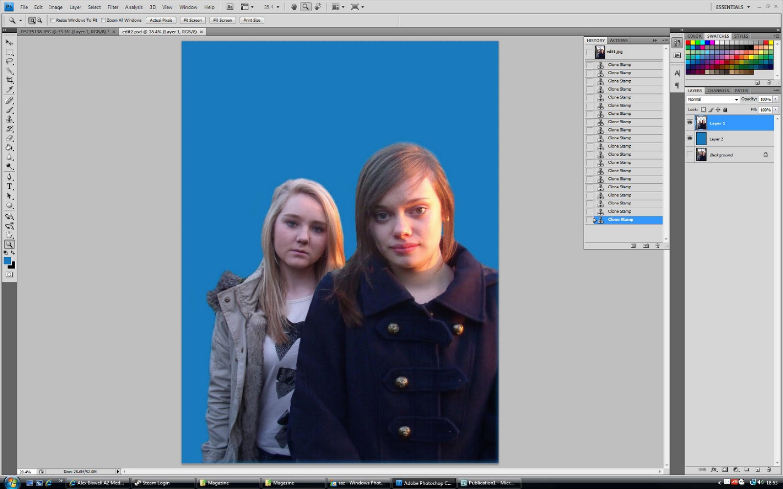
I edited the background filling it in a bright blue as the TV magazine I had researched had a blue background. I also chose this colour as it is not too distrasting; the actresses are still the main focus.
7.


I then began to create the name of the magazine. I made it in a red square with a white border. The word 'TV' white to make it appear bold and stand out against the red and blue. I also did this as I had seen it in two different television magazines.
8.

I made the headline of the magazine overlap the photo of Ellie and Sarah and had it in black bold writing. I thought the headline 'Holiday Horror' was a catchy title for a soap. I put it on a yellow background to support my TV magazine research and make it eye catching and stand out. I decided the subtitle 'Could this be the end for Sarah?!' would be in red to make it stand out and to make a link to the fact Sarah dies in the episode.
9.

Next I began to place my supporting images onto my magazine. I began with an image of my friend Annabel hoovering the carpet wearing a dress and heels. It was a photo I already had and had not taken specifically for my magazine but thought it seemed appropriate. I decided to have it supporting a new TV show called 'The Real Housewives'.
10.
I took a photo of Josie and Rachel to put onto the front page of my magazine. I decided I would say there is an exclusive interview from them both inside called "The Only Way is Kent".
 I cut them out of the background using the lasso tool.
  I then filled in the background grey.
 11.

I inserted the picture into the bottom light hand corner of the page. I also changed the background of "The Real Desperate Housewives" so that it is grey. I inserted a yellow star with 'NEW!' inside to draw attention to it and
11.

To support the picture of Josie and Rachel I wrote "Exclusive interview with Josie and Rachel about hit new reality TV show "The Only Way is Kent".
12.

I then inserted a white star similar to the one on my researched magazine with "BRITAIN'S GOT TALENT SECRETS INSIDE!"
13.

The final step was inserted a barcode and the date and price to make it look a professional magazine.
Wednesday, 15 December 2010
Photos for the Magazine Front Cover

I thought this photo went well as both girls have a very serious facial expression. They are both wearing the same clothes in which they wear in my trailer so this makes it look more convincing and obvious to the reader that the image of the two girls is specifically about the soap and not just an interview with the actresses. I particularly like the way I have positioned Ellie and Sarah so that Sarah, the victim, is standing more forward than Ellie. This pose looks more instense and many magazines such as the ones I have researched have used this pose.

I liked this this photo as they are both pulling serious expressions and I like the way they are standing. However the sunlights on the girls' photos ruins the quality of the photo. Additionally for a magazine front cover I prefer the position in which the characters are standing above.

This photo was not ideal as Sarah began to laugh as I took the photo.

Both Ellie and Sarah were laughing in this photo so I chose not to use it.

I took this photo of Josie and Rachel to feature in the corner of my magazine for an exclusive interview about "The Only Way is Essex". I thought this picture went very well as they both pulled serious faces looking the part. Rachel is pouting slightly going for a more seductive look and Josie has bent down so the height different isn't as obvious. I made them dress to look glamorous and sophisticated which I believe they did very well. The background did not matter as I had decided to cut them out anyway.

This was a photo I already had of Annabel from New Year's Eve and thought it would be appropriate for my magazine calling it "The Real Desperate Housewives".
Saturday, 4 December 2010
Plans for my magazine front cover

I wanted Sarah and Ellie to be the main focus of the magazine. I placed Sarah slightly infront of Ellie as she is the one who gets killed/ attacked so the story is more like her.
I also liked the position in which they are standing as it the same as the magazine front covers I have researched.
I created a very similar name of the magazine to that I have researched but changed it so it said 24/7 to avoid it being the same.
I decided to have the headline on a bold yellow background to draw attention to it.
Wednesday, 1 December 2010
Magazine front cover- Research
 I think this is a good example of a magazine front cover. The colours are bold and eye catching making the magazine attractive and appealing to read.
 The words "DEADLY BLAZE!" are written bolding across the page making it a main focus of the front colour. It is written in bold capital letters to draw attention to it and ensure the reader reads this before the smaller print. It is on a yellow background making it even more eye catching.
The way in which the Eastenders' characters Roxy and Ronnie are positioned on the front cover is effective as they are both smiling in the same way with the image overlapping the other images on the cover slightly. It appears as though Eastenders has the main story line for that week and is therefore the main focus.
The name of the magazine is in the corner, smaller than the image of the Eastenders' Mitchell sisters and the 'DEADLY BLAZE' title but is still equally effective and eye catching. It is written on a red background to make it bold and stand out against the rest of the magazine as the magazine name is incredibly important.
The magazine background is blue which compliments the red and yellow used. It is also slightly paler ensuring the images stand out on top of it.
Six smaller images have been used on the cover which look effective with supporting text of different colours.
There is text saying "X Factor SECRETS INSIDE" inserted in the image of a star to look more obvious to the reader when scanning the front page. It is in a red font immediately making it look bold.
 This magazine cover has an image of two people (same as the magazine above). The word "TV" is in the same location as the above magazine aswell, however I prefer the previous magazine I analysed.
 The two soap characters are sharing the same smile and position as each other which looks effective.
The headline "BROOKE'S TABOO LIAISON" is not as powerful and eye catching in this magazine. - It is in capital letters, however the white colour is not very appealing and eye catching.
There are three images instead of the six images above making it appear less crowded.
The colours used on the front cover are not as bright and effective as the previous magazine. I feel it is not as appealing to read.
Words such a "FIERY FINALE" are used to capture the reader's interest and make them want to purchase the magazine.
'WIN A FAMILY CAR' is another selling ploy to make the reader want to buy the magazine.

Subscribe to:
Posts (Atom)